RECIPE
COSMETIC BRAND
RECIPE Brand Identity Project
RECIPE is a global skincare brand sold in both Korea and China, holding the No. 1 position in the sunscreen category within the Chinese market.
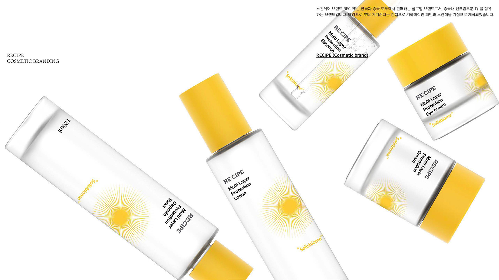
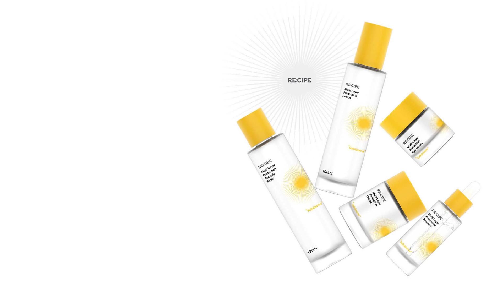
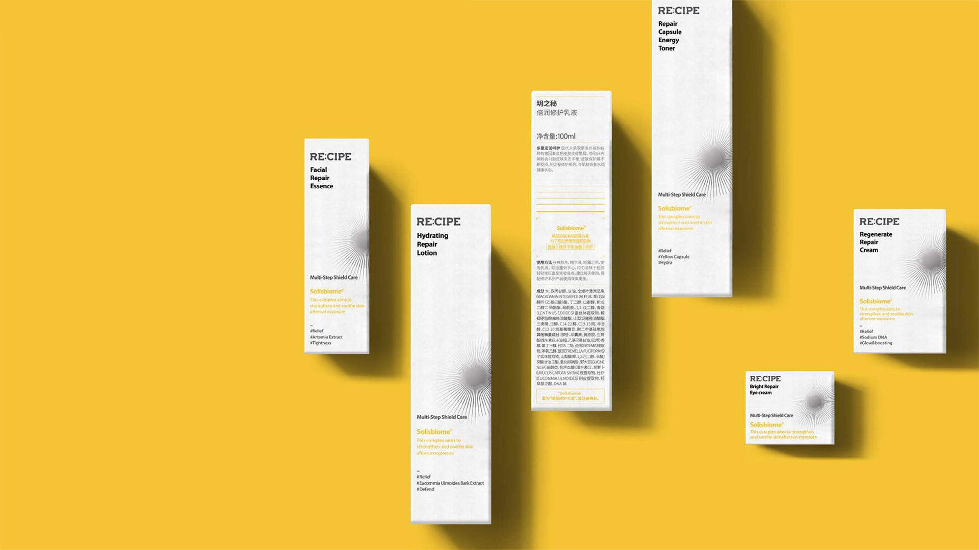
The brand’s concept, “protecting skin from the sun,” is visually represented through the use of geometric patterns and yellow as the primary design elements. This branding effectively communicates the protective function of RECIPE’s products while conveying a bright and optimistic image, solidifying the brand’s identity in the minds of consumers.
Client : COSMAX
Company Type : Cosmetic
Task : Package design(Graphic)
Sort : Shop
Date : 2021
RECIPE 브랜드 아이덴티티 프로젝트
RECIPE는 한국과 중국에서 모두 판매되는 글로벌 스킨케어 브랜드로, 특히 중국 내 선크림 부문에서 1위를 차지한 선도적인 브랜드입니다.
브랜드는 태양으로부터 피부를 지켜준다**는 콘셉트를 중심으로 설계되었으며, 이를 시각적으로 표현하기 위해 기하학적인 패턴과 노란색을 주요 디자인 요소로 활용했습니다. 이러한 브랜딩은 RECIPE의 제품이 제공하는 보호 기능과 밝고 긍정적인 이미지를 효과적으로 전달하며, 소비자들에게 브랜드의 정체성을 명확히 인식시킵니다.
Tableliter is a brand design consultancy based in Seoul, South Korea, founded with the aim of prioritizing conceptual visual design over traditional branding approaches to achieve distinctive and creative visual expressions. The company seeks to redefine perceptions in each brand's field, ensuring they stand out.
Tableliter goes beyond creating brand identity solely through logos and symbols, encompassing all elements comprehensively. This approach underscores the need for diverse ideas and skills in brand consulting.
In addition to its core services, Tableliter actively engages in UI design, editorial design, illustration, art directing, fashion design, and fashion consulting, further emphasizing its commitment to shaping unique visual identities for brands and helping them excel in their respective fields.

RECIPE
COSMETIC BRAND
RECIPE Brand Identity Project
RECIPE is a global skincare brand sold in both Korea and China, holding the No. 1 position in the sunscreen category within the Chinese market.
The brand’s concept, “protecting skin from the sun,” is visually represented through the use of geometric patterns and yellow as the primary design elements. This branding effectively communicates the protective function of RECIPE’s products while conveying a bright and optimistic image, solidifying the brand’s identity in the minds of consumers.
Client : COSMAX
Company Type : Cosmetic
Task : Package design(Graphic)
Sort : Shop
Date : 2021
RECIPE 브랜드 아이덴티티 프로젝트
RECIPE는 한국과 중국에서 모두 판매되는 글로벌 스킨케어 브랜드로, 특히 중국 내 선크림 부문에서 1위를 차지한 선도적인 브랜드입니다.
브랜드는 태양으로부터 피부를 지켜준다**는 콘셉트를 중심으로 설계되었으며, 이를 시각적으로 표현하기 위해 기하학적인 패턴과 노란색을 주요 디자인 요소로 활용했습니다. 이러한 브랜딩은 RECIPE의 제품이 제공하는 보호 기능과 밝고 긍정적인 이미지를 효과적으로 전달하며, 소비자들에게 브랜드의 정체성을 명확히 인식시킵니다.
