NUMERO13
JEWERLY BRAND
NUMERO13 Brand Identity Project
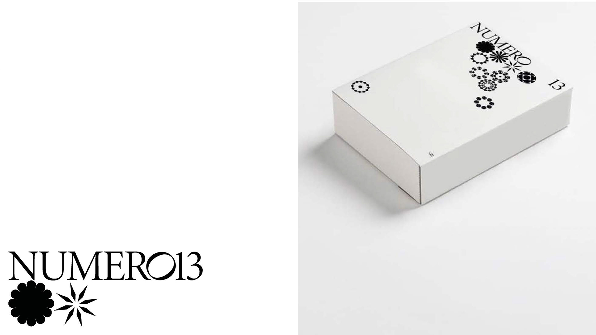
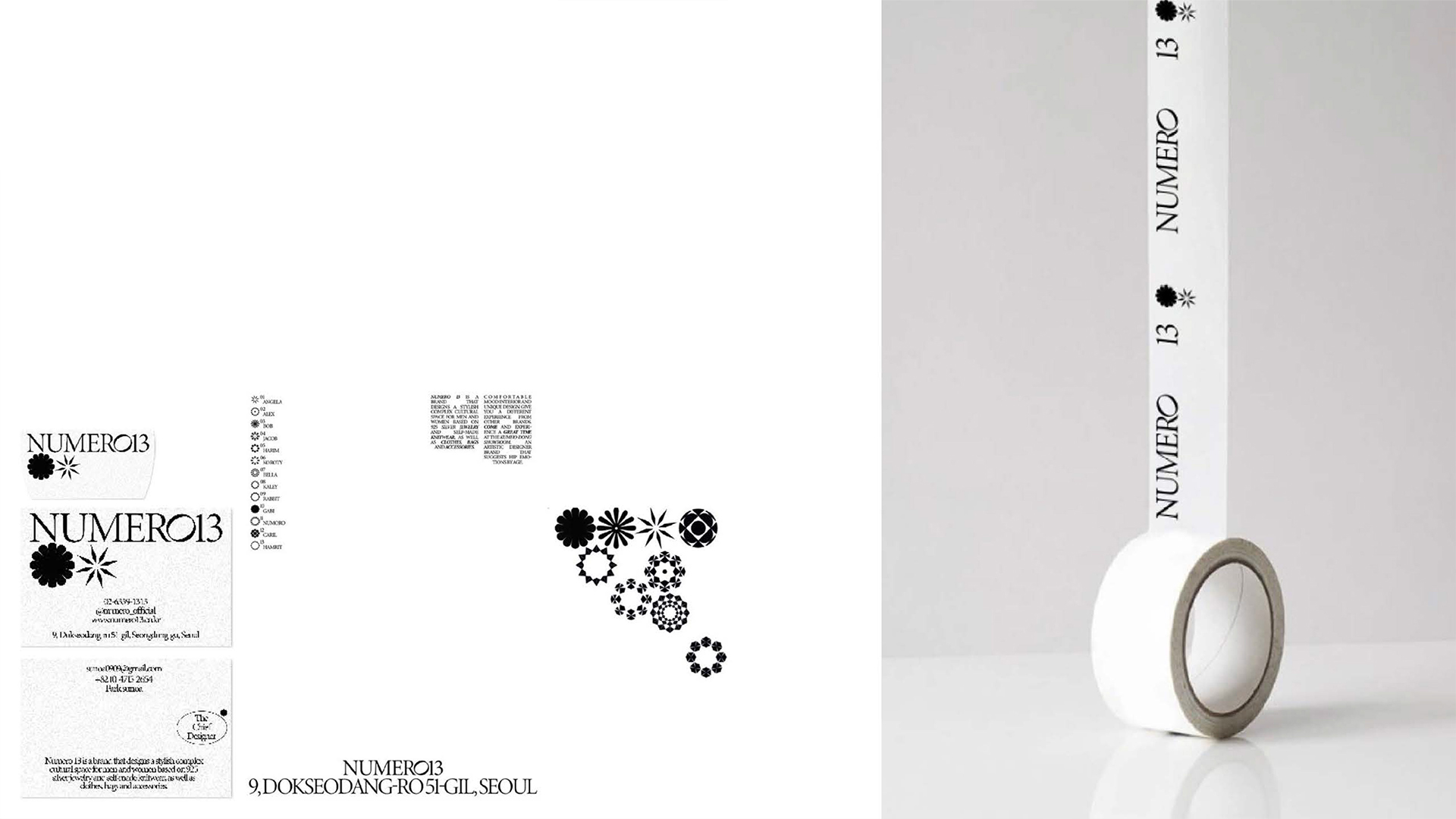
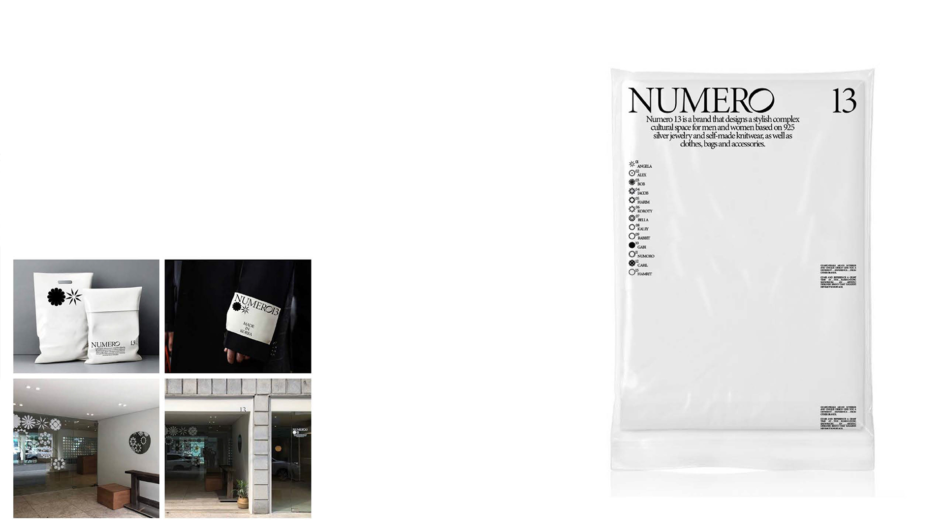
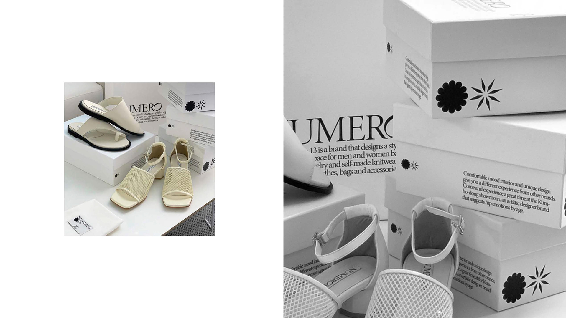
NUMERO13 represents the number 13, a figure deeply cherished by the client, and the brand is built upon 13 distinct symbols of significance. Each symbol embodies a unique meaning, serving as the foundation for crafting a cohesive and meaningful brand identity.
These symbols go beyond mere design elements; they play a pivotal role in shaping the essence of the jewelry creation process. Tabeliter developed a branding solution that visually reinforces NUMERO13’s identity, effectively communicating the brand’s philosophy and the significance of its symbolism.
Client : NUMERO 13
Company Type : Jewerly
Task : Branding
Sort : Shop
Date : 2020
NUMERO13 브랜드 아이덴티티 프로젝트
NUMERO13은 숫자 13을 의미하며, 이는 클라이언트가 가장 애정을 갖고 있는 숫자로, 13가지 상징성을 바탕으로 브랜드가 설계되었습니다. 각 상징성은 고유한 심볼로 표현되었으며, 이를 통해 브랜드 아이덴티티가 구체화되었습니다.
이 심볼들은 단순한 디자인 요소를 넘어, 주얼리 제작의 근간을 이루는 핵심적인 역할을 합니다. 테이블리터는 이러한 상징성과 디자인 철학을 바탕으로 브랜드의 정체성을 시각적으로 강화하며, NUMERO13이 전달하고자 하는 메시지를 효과적으로 표현하는 브랜딩 솔루션을 제안했습니다.
Tableliter is a brand design consultancy based in Seoul, South Korea, founded with the aim of prioritizing conceptual visual design over traditional branding approaches to achieve distinctive and creative visual expressions. The company seeks to redefine perceptions in each brand's field, ensuring they stand out.
Tableliter goes beyond creating brand identity solely through logos and symbols, encompassing all elements comprehensively. This approach underscores the need for diverse ideas and skills in brand consulting.
In addition to its core services, Tableliter actively engages in UI design, editorial design, illustration, art directing, fashion design, and fashion consulting, further emphasizing its commitment to shaping unique visual identities for brands and helping them excel in their respective fields.

NUMERO13
JEWERLY BRAND
NUMERO13 Brand Identity Project
NUMERO13 represents the number 13, a figure deeply cherished by the client, and the brand is built upon 13 distinct symbols of significance. Each symbol embodies a unique meaning, serving as the foundation for crafting a cohesive and meaningful brand identity.
These symbols go beyond mere design elements; they play a pivotal role in shaping the essence of the jewelry creation process. Tabeliter developed a branding solution that visually reinforces NUMERO13’s identity, effectively communicating the brand’s philosophy and the significance of its symbolism.
Client : NUMERO 13
Company Type : Jewerly
Task : Branding
Sort : Shop
Date : 2020
NUMERO13 브랜드 아이덴티티 프로젝트
NUMERO13은 숫자 13을 의미하며, 이는 클라이언트가 가장 애정을 갖고 있는 숫자로, 13가지 상징성을 바탕으로 브랜드가 설계되었습니다. 각 상징성은 고유한 심볼로 표현되었으며, 이를 통해 브랜드 아이덴티티가 구체화되었습니다.
이 심볼들은 단순한 디자인 요소를 넘어, 주얼리 제작의 근간을 이루는 핵심적인 역할을 합니다. 테이블리터는 이러한 상징성과 디자인 철학을 바탕으로 브랜드의 정체성을 시각적으로 강화하며, NUMERO13이 전달하고자 하는 메시지를 효과적으로 표현하는 브랜딩 솔루션을 제안했습니다.
