
AUFGLET
CAFE&BAKERY
AUFGLET Café and Gallery Branding Project
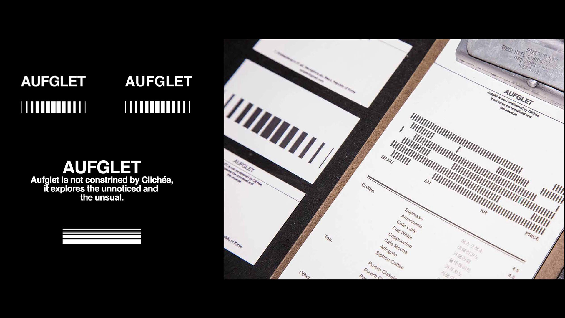
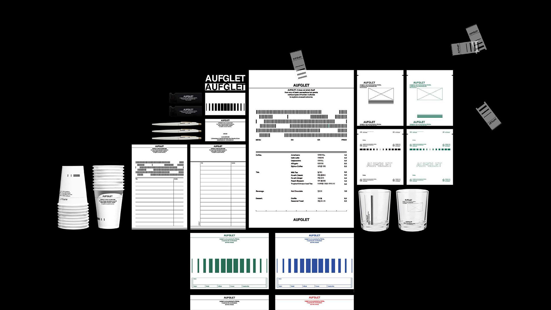
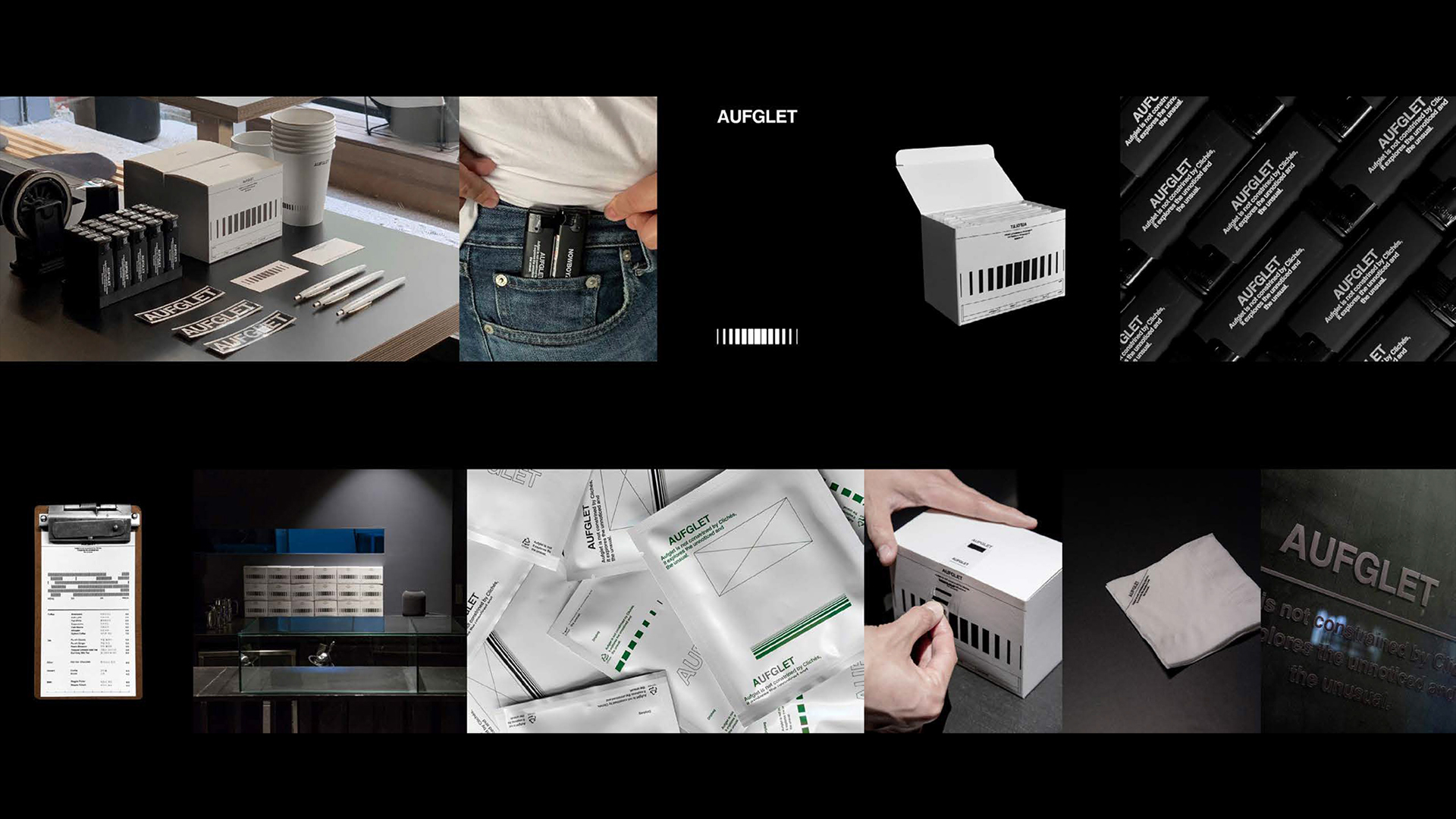
AUFGLET is a café and gallery located in Seoul, with branding centered around the key concepts of Refine and Masculine. The project utilized clean geometric shapes and a monochromatic palette to create a sophisticated and impactful brand identity.
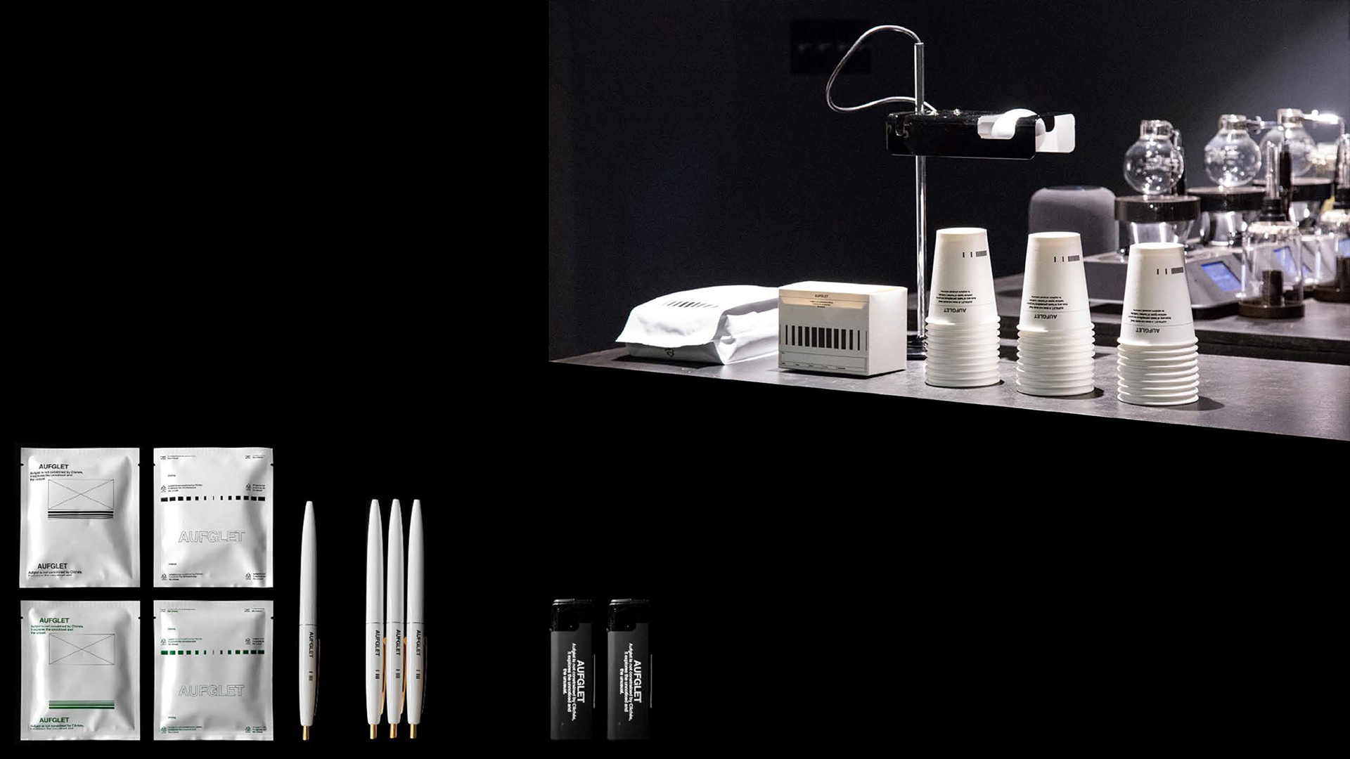
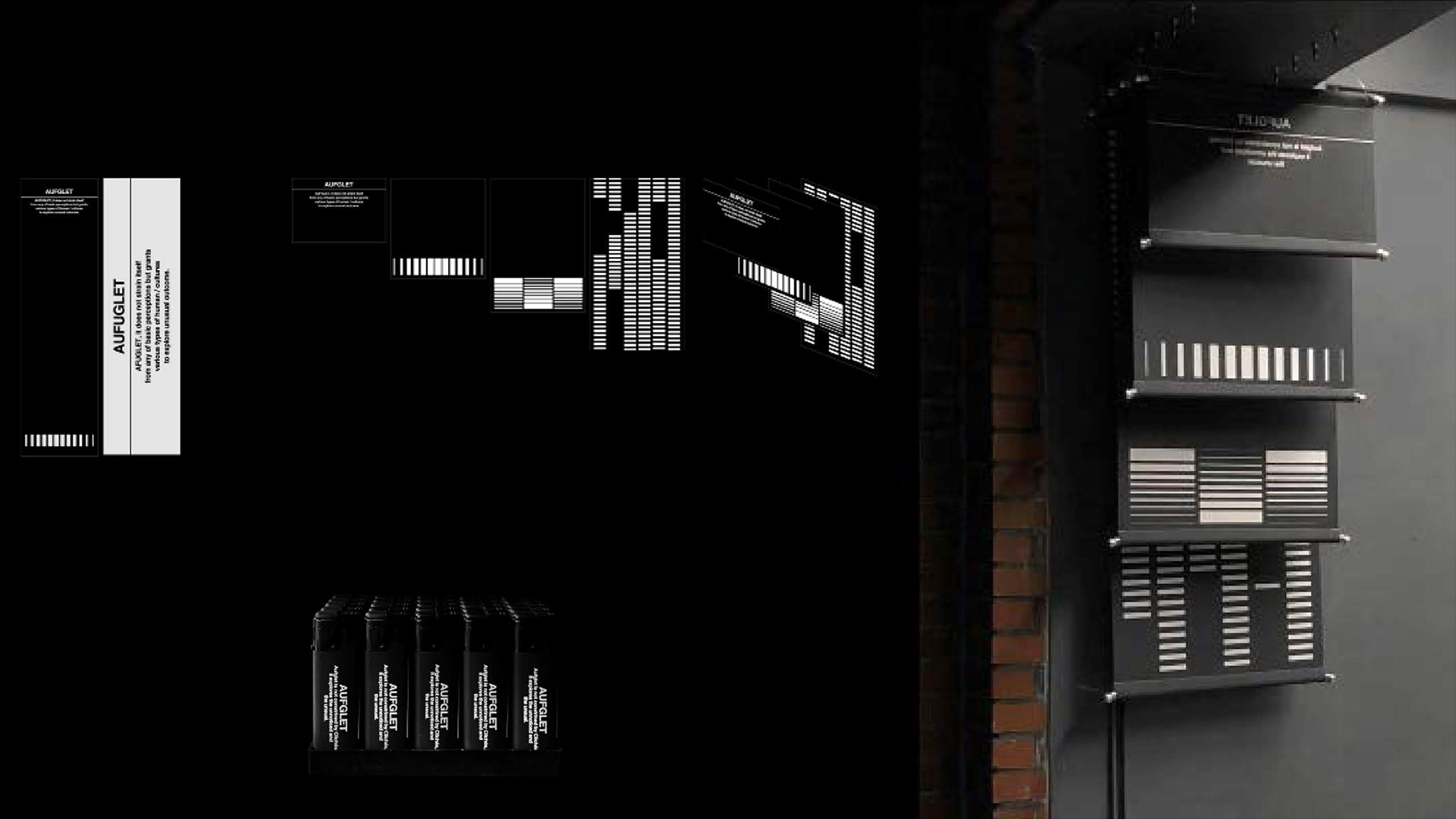
The branding was brought to life through various objects used in the café space, such as cups, menu boards, signage, and merchandise. A consistent design language was applied across all elements to solidify the brand’s identity. Notably, the signage reinterpreted AUFGLET’s signature stripe motif from multiple angles, crafting a unique visual expression in the form of a Korean-style hanging scroll.
This project successfully balanced the dual nature of the café and gallery, delivering a polished and masculine design that strongly communicates AUFGLET’s brand identity.
Client : Aufglet
Company Type : Bakery
Task : Branding
Sort : Cafe&Shop
Date : 2018
AUFGLET 카페&갤러리 브랜딩 프로젝트
AUFGLET은 서울시에 위치한 카페 겸 갤러리로, Refine(정제됨)과 Masculine(남성적인)을 주요 컨셉으로 한 브랜딩 작업이 진행되었습니다. 간결한 기하학적 도형과 흑백의 미니멀한 색조를 활용하여, 세련되고 강렬한 브랜드 이미지를 구축하는 데 초점을 맞췄습니다.
브랜딩은 카페 운영에 필요한 다양한 오브젝트를 통해 구현되었습니다. 컵, 메뉴판, 간판, 굿즈 등 실제로 공간에서 사용되는 요소들에 통일된 디자인 언어를 적용하여 브랜드의 정체성을 더욱 구체화했습니다. 특히 간판은 **aufglet**의 심볼로 사용된 스트라이프를 다각도로 재해석해, 한국식 족자 형태로 디자인함으로써 독창적이고 매력적인 시각적 경험을 제공했습니다.
이번 프로젝트는 카페와 갤러리라는 공간적 특성을 조화롭게 담아내며, 정제되고 남성적인 디자인 감각으로 AUFGLET의 브랜드 아이덴티티를 강렬하게 전달했습니다.
Tableliter is a brand design consultancy based in Seoul, South Korea, founded with the aim of prioritizing conceptual visual design over traditional branding approaches to achieve distinctive and creative visual expressions. The company seeks to redefine perceptions in each brand's field, ensuring they stand out.
Tableliter goes beyond creating brand identity solely through logos and symbols, encompassing all elements comprehensively. This approach underscores the need for diverse ideas and skills in brand consulting.
In addition to its core services, Tableliter actively engages in UI design, editorial design, illustration, art directing, fashion design, and fashion consulting, further emphasizing its commitment to shaping unique visual identities for brands and helping them excel in their respective fields.

AUFGLET
CAFE&BAKERY
AUFGLET Café and Gallery Branding Project
AUFGLET is a café and gallery located in Seoul, with branding centered around the key concepts of Refine and Masculine. The project utilized clean geometric shapes and a monochromatic palette to create a sophisticated and impactful brand identity.
The branding was brought to life through various objects used in the café space, such as cups, menu boards, signage, and merchandise. A consistent design language was applied across all elements to solidify the brand’s identity. Notably, the signage reinterpreted AUFGLET’s signature stripe motif from multiple angles, crafting a unique visual expression in the form of a Korean-style hanging scroll.
This project successfully balanced the dual nature of the café and gallery, delivering a polished and masculine design that strongly communicates AUFGLET’s brand identity.
Client : Aufglet
Company Type : Bakery
Task : Branding
Sort : Cafe&Shop
Date : 2018
AUFGLET 카페&갤러리 브랜딩 프로젝트
AUFGLET은 서울시에 위치한 카페 겸 갤러리로, Refine(정제됨)과 Masculine(남성적인)을 주요 컨셉으로 한 브랜딩 작업이 진행되었습니다. 간결한 기하학적 도형과 흑백의 미니멀한 색조를 활용하여, 세련되고 강렬한 브랜드 이미지를 구축하는 데 초점을 맞췄습니다.
브랜딩은 카페 운영에 필요한 다양한 오브젝트를 통해 구현되었습니다. 컵, 메뉴판, 간판, 굿즈 등 실제로 공간에서 사용되는 요소들에 통일된 디자인 언어를 적용하여 브랜드의 정체성을 더욱 구체화했습니다. 특히 간판은 **aufglet**의 심볼로 사용된 스트라이프를 다각도로 재해석해, 한국식 족자 형태로 디자인함으로써 독창적이고 매력적인 시각적 경험을 제공했습니다.
이번 프로젝트는 카페와 갤러리라는 공간적 특성을 조화롭게 담아내며, 정제되고 남성적인 디자인 감각으로 AUFGLET의 브랜드 아이덴티티를 강렬하게 전달했습니다.
